|
This isn't really a step-by-step guide to making a
webcomic or anything... this is just the process I use when making a strip, in
general. I also mention the things that I think about when I'm developing one,
to give a little insight about the mechanics of the strip and my art process in
general. |
|
The Sketch |
|
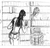
This
was actually just a "general" sketch I had done more than a month ago. I
have several of these. They're useful when the location isn't as important
as the text or characters. Astute readers will notice
that the sketch I used for the "In The Works" image didn't actually show
up in the final strip. There are a few reasons for that, but mainly, it's
my strip, and I changed my mind about what I wanted to do with it. :)
You'll live. Once I have thought out the dialogue and
layout of the strip, I needed to draw it. Actually, dialogue is a huge
part of the layout, and probably mostly overlooked by amateur comic
artists. I make a special effort (most times) to make sure that I A: have
enough room for the dialogue (word bubbles), and B: the layout of the
panels and placement of the characters are conducive to readability. I've
messed up a few times, but I'm working on it. |
|
|
Formatted Sketch |
|
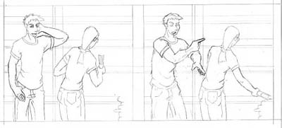
This is "actual size" on paper, though on this page it's been shrunk down
for viewing. Sometimes my format sketches are smaller than the final
drawing size (which fills most of an 8.5"x11"). In those cases, I use my
scanner as a photocopier to enlarge the sketch, in order to make a
full-size ink. Note that the scan is pretty light - I've
actually darkened it a bit. I don't usually ink right over my pencils, but
lately with R.D.T. strips, if I manage to do my pencils neatly (and not
press too hard or erase all over the place) then I'll use the same sheet
for inking.
Also note that I didn't do the books at all - the background I left as a
"suggestion," though I DID straighten the shelves out. Incidentally, I use
a T-square for straight lines (including the borders), which ensures that
the line I draw will be perpendicular to the edges of the paper.
Ms. Harper in this case was traced via lightbox from the sketch, since she
doesn't move. Why redraw something twice when you did it fine the first
time? However, her relative position changed in the sketch, to better fit
the panel's layout. The panel needs to fit Davis, Ms. Harper, as well as
the partially-shown stack of books.
The other thing I keep in mind when doing the formatted sketch is the
placement of the characters not only in the panel, but to each other.
Davis's hand is pretty much touching Ms. Harper. That's probably a mistake
on my part, I should have let his hand overlap her a little. It would have
suggested depth, instead I got sort of a "cramped" look. Ah well, c'est la
vie. Note that I have left a lot of empty space for word
balloons. This is when I also begin to think about color. More on that
later. |
|
|
Inks |
|
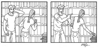
In this instance, I've inked right over my pencils, and
then erased the pencil. I can't do that with all of my strips, either
because I've gone over the pencils so much as to marr the paper, or
because the strips were sort of "all over the place." In those cases, it's
easier to use a lightbox to re-draw the inked version on a new sheet of
paper. I did use a lightbox on this piece to duplicate
the bookshelves (as well as Ms. Harper, earlier). After drawing them
neatly (with my .01 pen and t-square) in the left-hand panel, I
photocopied it with my scanner, and used a lightbox to trace the
right-hand panel from it. This way, I get the same background without
making a hundred mistakes. I use pens of different width
to suggest foreground and depth. It's hard to tell in this small version,
but the outline around Davis and Ms. Harper (and the stack of books) is
slightly thicker than the lines I used for the books/bookshelves. This
"pops" them out into the foreground. It's an old trick. Also notice the
thickest line is around the panel borders. That way it acts more as a
"frame." I already knew that I wanted to experiment with
a different coloring style with this strip. Up to this point, I had been
inking with little depth, and relying on the coloring process to put
things in the background or foreground, to render it more or less
important to the eye. With this strip (and possibly future ones) I wanted
to color it "flatly" - saving me time in the long run, hopefully, and
making the panels look less "cluttered" with color. Line width is crucial
to flat-color comics, because that is where you're going to get your
depth. Incidentally, for those who like comics and want
to read more about the mechanics and methods in them, check out Scott
McCloud's Understanding Comics. It's an excellent book and really
illustrates a lot of the theory and planning that goes into a comic. There
are quite a few "unnoticed" aspects of a comic that are essential to a
successful strip. He also has a book called Reinventing Comics that is
geared specifically toward webcomics. I haven't read it, but I have heard
that it's also quite good. |
|
|
Color, At Last! |
|
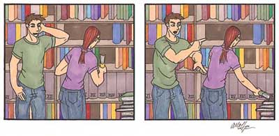
I'm a big color buff. I'm usually more interested in the
coloring techniques in an image than the actual drawing techniques. My own
style is relatively simple, so it makes it easy to color each R.D.T.
strip. A lot of webcomics out there either A: aren't colored, or B: are
colored digitally. For that reason I decided to color R.D.T. with markers,
though digital coloring would probably have been faster. (I still use
digital coloring in some cases - there was one strip which I am planning
on redoing, and there is the 4th of July image/strip. That project was too
big to take on with just markers.)
In some cases, I do fill in the backgrounds digitally. If there is a large
area of blank wall, I'll use PhotoShop's "Fill" tool rather than use up my
$3-apiece markers. I'm still working on getting the "filled" portions to
mesh well with the hand-coloring. In this case however, it's all marker.
Generally, when I do a background, I use "muted" colors. This way the
brighter colors (like the colors I use for hair and clothes) will visually
stand out, helping put them into the foreground. In this case however, I
felt free to use dozens of colors for the books. Why? The books are small.
The figures are large. Their clothes are larger areas of color than any of
the books. The "mosaic" of colored books in the back actually makes them
fairly uninteresting to the eye (without being a boring background),
whereas the bright, large color on Davis and Ms. Harper immediately draw
the eye. "Hey, we're big, look at us!" Additionally, the books are all
linear and relatively uniform. Ms. Harper and Davis's organic shapes pull
them out of the background, also. I would never have made a background
that busy if they weren't all rectangular. Note that I used some of the
same colors in both their clothes AND the books - this is a visual trick
to help "mesh" the fore and backgrounds, so they don't look like they're
just stuck onto a background. Note the second-to-bottom
row of books. They're all the same color (they're a Dangerous Thing, keep
an eye out for them in the Danger Showcase.) They're encyclopedic in
nature, so needed to match, color-wise. Rather than risk drawing attention
to them, I colored them a "middle grey." You notice them (which is good,
since they're a featured Dangerous Thing) but they don't detract from the
foreground at all. The last note about this process is
the extent to which I colored. I KNEW there would be word bubbles above
and to the right of Ms. Harper - but I colored those areas anyway. Some
people don't bother coloring what they know will get covered up, but I
don't do that. I don't like leaving things incomplete anyway, but I also
never know when I might want a "bubble-free" version, or something. It
just makes for nicer originals. |
|
|
Dialogue is King |
|
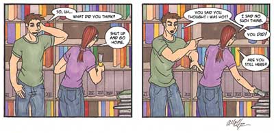
On a technical note, I add the word bubbles in Adobe's
PhotoShop. It's easier than you think. First I use the type tool to write
the words I want, in the font I want. For instance, most dialogue is done
with A.C.M.E. Secret Agent 10pt (Blambot). Davis's whining is done in
Wichita 16pt (Ray Larabie?). I move those text layers to where I want them
to be.
Then I make a new layer that is between the
background (the strip) and all the text layers. Using the oval-select
tool, I draw the bubbles. You can move them to fit correctly around the
text if you misjudged the origin point. By "correctly," I mean that the
text should fit comfortably inside the bubble, with "breathing room" all
around. Otherwise the words look cramped. Then, Edit-> Fill-> Foreground
Color (which I set to white.) Do that for all the word bubbles, then use
the freehand selection tool to add the pointers. I use an "Outer Glow" set
to 100% opacity, 600% intensity, and 2-pixel blur to do the outlines.
Borders can be used to distinguish between overlapping bubbles, also - see
the top-right trio of dialogue. (I use two layers of word bubbles for
that.) I've seen some comics who give their word bubbles
really thick outlines. I don't like that (unless it matches with the rest
of their line widths, such as Penny Arcade), because it pulls them up into
the foreground even further than the characters, or whatever the
foreground is supposed to be. I set mine at 2 pixels to match the same
width as the background lines' width. The bubbles' whiteness is enough to
pop them out. Note I've had to cover up some of my lovely
books, but that's fine. Covering chunks of non-essential background is
better than covering a character's head, or breaking way out of frame. (On
a side note, I DO break a word bubble out of frame intentionally, just to
break things up a bit, or to "connect" related frames... look for them!)
The only downside to my "don't cover the character if I don't have to"
rule is that one in twenty I'll have an awkward looking word bubble, that
doesn't seem to fit into the overall flow of the word bubbles.
Also note that the word bubbles read left-to-right, as far as the
conversation goes, as well as up to down. That's what I meant by "flow."
The reader shouldn't have to figure out what they're supposed to read
next. If I were in Japan, the whole comic would be flipped around, because
they read right-to-left. Dialogue flow in a comic is trickier than you'd
first think - I've made a few questionable word bubbles.
That's really it. I hope you found it interesting. There's a lot more that
goes into a comic than I've mentioned here, but this isn't the Complete
Theory of Comics or anything. If you want that, go get Understanding
Comics. This is just what I do. |
|